
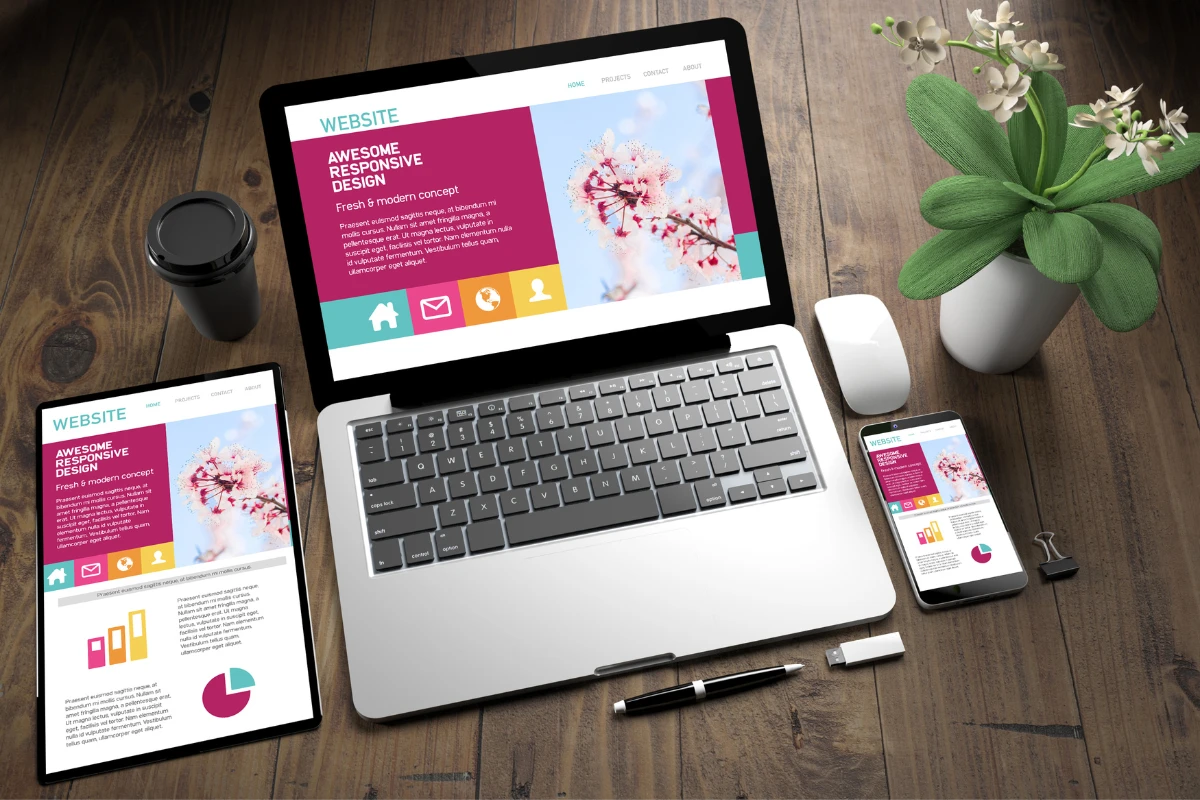
In today’s digital era, mobile devices dominate internet browsing. Whether people are on the go, lounging at home, or taking a quick break at work, their smartphones and tablets are often the first devices they reach for. This shift means having a website that looks and works great on mobile is no longer just a “nice-to-have”; it’s a necessity.
So, if you’re wondering whether WordPress websites can be responsive on mobile and tablet, the simple answer is a resounding “Yes!” In fact, the platform has been a forerunner in championing mobile responsiveness.
Throughout this post, we’ll delve deeper into how WordPress ensures your content shines across all devices.
Is WordPress Mobile-Friendly?
Absolutely, WordPress is not just mobile-friendly; it’s built with mobile responsiveness at its core. But what does this mean? Mobile responsiveness ensures that your website adjusts and looks great on any screen size, from desktop monitors to the smallest smartphones. The platform achieves this by dynamically resizing, hiding, shrinking, or enlarging the website to make it look good on any screen.
WordPress themes, especially the newer ones, are designed with this responsiveness in mind. They use flexible grids and layouts, as well as well-scaled images, ensuring that your content appears properly, no matter where it’s viewed. So, whether someone is browsing your site from a tablet in portrait mode, a phone in landscape, or any other device, WordPress strives to deliver an optimal viewing experience.

This adaptability is a testament to how WordPress recognizes the diverse ways users access content today and prioritizes a seamless browsing journey across devices.
Designing the Mobile Version on WordPress
One of the standout features of WordPress is its dedication to ensuring that website owners can offer the best user experience across all devices. With the rise of mobile browsing, this means not just squeezing your desktop site onto a smaller screen, but genuinely crafting a user experience optimized for mobile devices.
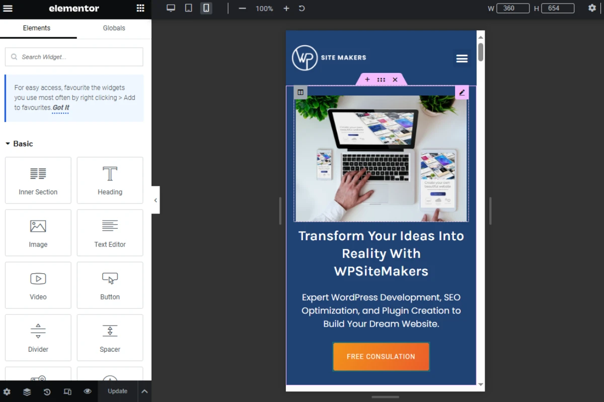
Many website-building tools within WordPress, especially page builders like Elementor, allow you to switch views between devices. This means you can see how your site looks on desktop, tablet, and mobile directly from the editing dashboard. But here’s the best part: you can modify the mobile view without altering the desktop version.
For instance, while using Elementor, there’s an option to toggle between device views. If you feel a particular section looks too cramped on mobile, you can adjust its spacing, change font sizes, or even hide specific elements that aren’t necessary for mobile viewers. These changes will only reflect on the mobile version, leaving your desktop design untouched.
This granularity in design control ensures that you’re not just making your site ‘fit’ on a mobile screen, but you’re truly optimizing it. You can craft unique navigation menus for mobile, use mobile-specific widgets, and even adjust the color schemes. WordPress, with its tools and plugins, offers a robust platform to design a mobile experience that’s intuitive, fast, and delightful for users.
Why Care About Mobile Views?

In today’s digital age, ignoring the mobile experience is no longer an option. But why is mobile responsiveness such a big deal?
1- Majority of Users are on Mobile: Recent studies have shown that over 50% of global website traffic comes from mobile devices. Depending on the niche and audience, for some websites, this figure can be even higher. This means that more than half of your visitors are likely viewing your site from a phone or tablet. Offering them a subpar experience could deter them from staying or returning to your site.
2- Improved Search Engine Rankings: Search engines like Google prioritize mobile-friendly websites. In fact, Google’s mobile-first indexing means the search engine primarily uses the mobile version of the content for indexing and ranking. If your site isn’t optimized for mobile views, it could hurt its position in search results, limiting its visibility and reach.
3- Enhanced User Experience: Think of the frustration when a user has to pinch and zoom to read the content or when buttons are too small to be tapped. A mobile-optimized site removes such barriers, offering seamless navigation, quicker load times, and ensuring content is easily digestible on smaller screens.
4- Increased Engagement and Conversions: A site tailored for mobile can lead to longer visit durations and higher conversion rates. When users find it easy to navigate and take actions on your site, they are more likely to make a purchase, sign up for a newsletter, or engage in other conversion activities.
Simply put, in an era where smartphones are virtually extensions of ourselves, ensuring your WordPress website is not just viewable but optimized for mobile is crucial. It’s not just about looking good; it’s about functionality, user experience, and even the potential success of your online presence.
Making Your Site Look Great on Mobile

The mobile view of your WordPress site needs as much attention, if not more, as its desktop counterpart. A few design changes can significantly improve the mobile experience. Here’s how:
Use a Responsive Theme: Begin with a foundation that’s built for mobile. Most modern WordPress themes are responsive by default. Ensure that the one you pick automatically adjusts to different screen sizes.
Test on Different Devices: Don’t just assume it looks good on one device and will be the same on others. Test your site on various mobile and tablet screen sizes to see how it performs.
Simplify Navigation: On smaller screens, less is more. A simplified menu with clear calls to action can significantly improve user navigation on mobile.
Optimize Images and Videos: Ensure your media elements are mobile-friendly. Compress images to speed up loading times and use formats that are universally supported.
Use Mobile Plugins: WordPress offers several plugins that can enhance the mobile view of your site. Plugins like ‘WPtouch’ can help create mobile-optimized versions of your website.
Prioritize Important Content: Make sure the most critical information is at the top. Users shouldn’t have to scroll endlessly to find what they need.
Check Button Sizes: Fingers are larger than mouse pointers. Ensure that buttons are large enough to tap easily.
Conclusion
In an increasingly mobile-driven world, ensuring your WordPress site is mobile-responsive is non-negotiable. It’s not just a design preference but a necessity for providing the best user experience, achieving better search engine rankings, and ensuring your site’s success.
Remember, it’s always beneficial to revisit and test your site’s mobile responsiveness regularly. If you find this task daunting or need expert insights, platforms like WPSite Makers are there to assist you. They can guide you in ensuring that your WordPress website isn’t just functional but also aesthetically pleasing and effective across all device types.
Take action now: Regularly test your site on various mobile devices, and don’t hesitate to make necessary tweaks. Your mobile users will thank you!