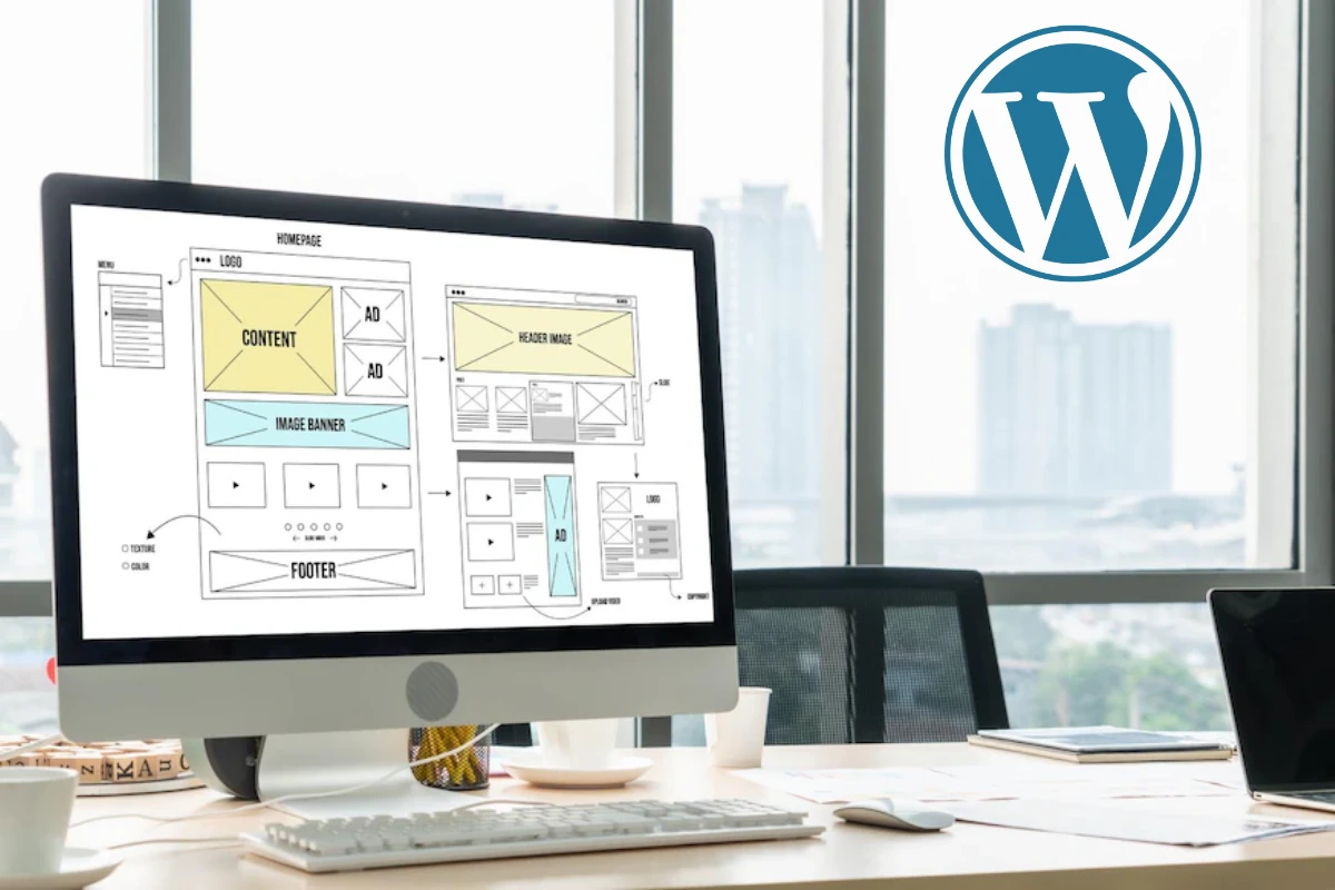
Redesigning your WordPress website becomes a dream and a goal for you personally or for your company. You certainly don’t like the current version of your WordPress website; that’s why you are so eager to make the changes immediately, and you are desperately searching for the best solution for your WordPress website.
In this comprehensive blog post, you’ll embark on a journey guided by the ultimate step-by-step manual. Discover the precise techniques for professionally redesigning your WordPress website and transforming it into the dream site you’ve always envisioned.
By following the next steps and dedicating time, you are guaranteed to redesign a truly satisfying WordPress website. You won’t need additional tools beyond your computer and the WordPress platform. Let’s get started:
1. Know Your Goal + Look for Competitive Websites in the Same Niche:
Okay, now, first things first, hands on your computer: browse your current website and note exactly why you decided to redesign it. Identify the aspects that you dislike the most, pinpoint the issues you wish to address and determine which pages or sections leave you feeling frustrated and unsatisfied. Write them all down and organize the list.

Another tip I usually recommend to our clients is to explore beautiful and successful websites in the same niche. This will provide you with ideas, inspiration, and motivation to incorporate into your redesign.
Now, after you’ve documented what you dislike about your current site and have explored competitive websites, draw a separating line and outline what you want for your website. It’s like creating a table with two columns: one for what you dislike and another for what you hope to include in your new version.
With this simple process, you’ll have a clearer goal, and you won’t feel overwhelmed or frustrated about where to begin.
2. Prepare the Structure of Your Website:
Now, let’s get real: defining your structure is the most crucial step in redesigning your website. Writing down the number of pages, the content for each page, etc., will make the image much clearer for both of you.
whether you are personally redesigning your WordPress website or planning to hire a company or a freelancer, having a clear structure is the key to mutual understanding; without it, it is harder to build your masterpiece.
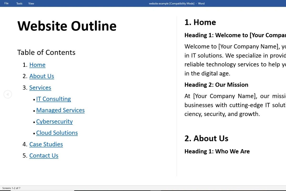
Here’s how you can prepare the structure of your new WordPress website:
- Create a new Word file: On the first page, define the number of pages, name the pages, and create a table of contents that lists the pages in order, along with the main headings you plan to include on each page.
- Starting from the second page: begin crafting content for each page. For example, for the home page, write the first headline, subheadline, and paragraph. Add suggestions like recommending the addition of columns of icons or a hero image that complements the content. While filling in the content in your Word file, add comments for yourself to review or for your developer.
- Fill each page with headlines, suggested images, and suggested format (optional), and continue the same for the remaining pages.
Note: If your current website contains blog posts, do not try to delete or alter them. Blog posts are the main reason why you drive traffic to your website. Just prepare the content and structure for the main pages; deal with the blog posts later on.
Also, it is important that you consider a backup of your current website, because you don’t know what’s going to happen while redesigning, an error can occur and you may lose data, so it is important that you have a backup plan, then you can safely restore your current version.
3. Decide the Color Palette and Typography:
Now, the magic is getting prepared with the color palette and typography. Let’s begin with the color palette of your website. By palette, we mean the collection of colors that you’re going to use in your website—what colors will cover background sections, header and footer background colors, and the color of the content.
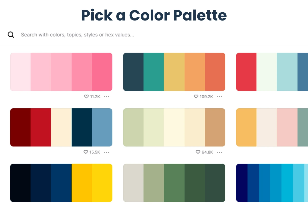
It is recommended to keep your main headlines and paragraphs in either black/dark color or white/bright color, as these are the most commonly used and effective choices for content/text.
The challenge here is deciding which colors will dominate your website. Will it have a dark aspect, a bright layout, or both?
Pro Tip: To decide on the color palette and the main background color, I always take a look at the logo colors. After all, your website should fit seamlessly with your brand logo.
Here’s what I do: I download the logo, pick the major colors from it (for example, the most used color is blue), take the hex code of that color, and visit a website called Coolors.co.
Using the ‘explore palette’ feature, I paste my hex code. Coolors.co generates several color palettes that perfectly complement the color of my logo. This method helps me decide the color scheme for my WordPress website.

Finally, select a font for headlines and another for paragraphs, or choose a font that you will use throughout your entire website. This choice depends on your preferences and the font used in your logo. While selecting a font is not as challenging as picking colors, it’s beneficial to experiment with different options until you find the perfect combination for your site.
4. Install All the Needed Plugins:
Before diving into the building process, ensure you have all your requirements in place. This includes the plugins you’re going to use on your website. The choice of plugins will depend on the features you outlined in your initial phase.
Remember when I advised you to list what you wish to have in your new WordPress website? Exactly! Most of the time, each new feature requires a corresponding plugin. Collect all the necessary plugins and install them at once.
For example, install your preferred page builder, such as WPBakery, Elementor, Divi, etc. If you plan to sell products or services, install WooCommerce. Incorporate caching plugins, membership pro if you are including user account creation, and other plugins based on your specific goals for the website.
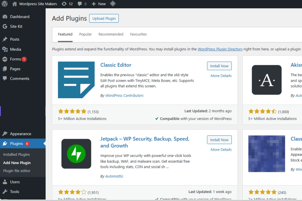
Keep in mind that it’s not advisable to install an excessive number of plugins. The more plugins you add to your website, the heavier it becomes. Select only the essential ones to keep your site running smoothly. (keep the essentials) .
Tip: for the old plugins of your current website version, have a look and try to filter and delete all the unnecessary plugins .
5. SEO: Strengthening Your Website’s Foundation

Most of the Time Applying SEO comes at the end of redesigning/building. But Let me Explain, SEO is not just a tool to use; it’s a set of guidelines and tips to follow during the building process.
SEO is like including certain ingredients in your building process to ensure your structure stays strong over time, enduring various challenges.
I strongly recommend focusing on and incorporating SEO guidelines into your redesign. Doing SEO after redesigning or completing your website is the biggest mistake you can make. Not only will you lose time, but you’ll also feel lost. I’ll explain why in a moment. Here are the guidelines you need to follow while building:
- One H1 per page: If you want to display your page title, ensure you include only one H1 heading per page. You can use H2 as main headings and H3/H4 as subheadings for your main content. This way, your page will be organized, and Google can understand the organization through these headings.
- Convert your images to WebP: The most common reason why your page takes a long time to load is that your images are not optimized enough. Large-sized images can significantly impact your page speed.
Here’s what you need to do: If you have PNG/JPEG images, make sure to convert them to WebP using tools or Windows apps like XnConvert, etc. The benefit of WebP is that when you convert a 2 MB PNG image to WebP, not only does the size decrease to under 200 KB, but you also won’t lose noticeable image quality. - Include Alt text for images: Make sure that your images have good titles plus include alt text for each, this will make Google understand more what your images are about.
- Each page has certain keywords: When working on specific pages, ensure that you demonstrate to Google or other search engines that you are incorporating relevant keywords into your text.
These are the main aspects of SEO when redesigning your WordPress website. After completing the redesign, you can rely on caching plugins, SEO tools, etc., to make it faster and more optimized. However, I’m confident that you won’t need more than that.
Note: After completing the next steps you will have another dedicated section that you need to do to make sure that Google indexes your website and gets more visitors.
6. Craft Your Header and Footer:
Alright, I really love this step because honestly, building the header and footer will give you a glimpse of the resulting website. After choosing the colors, the first places you’re going to apply these colors are on the header and footer, which is why I’m saying you’ll get a sneak peek of your website from this step.
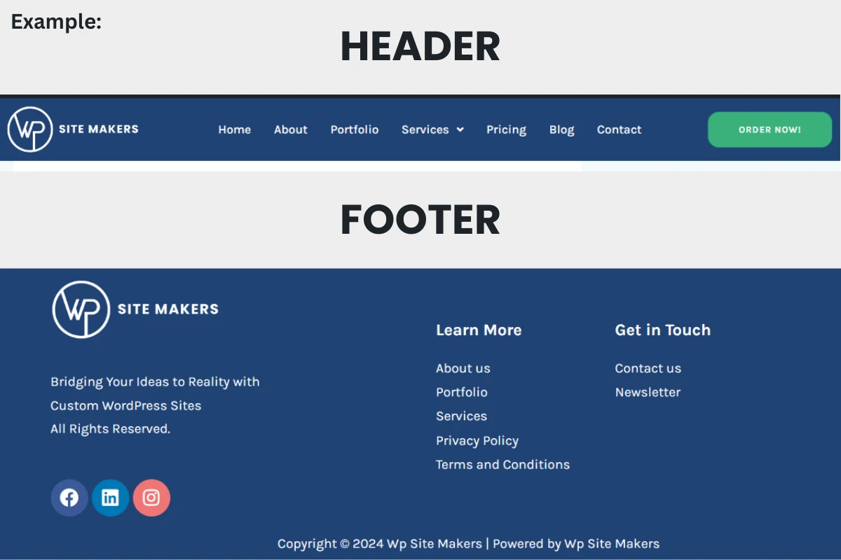
Let’s start with the header. In most cases, we include three blocks in the header. Generally, the first obvious block is the logo, the second is the menu, and the third is the call-to-action button. This is a common structure, but you can definitely make other choices.
However, having a logo in the header is a must, and the menu is where visitors can easily navigate and switch from page to page, making it a good idea to place a clear menu there.
Before moving on to the footer, switch to the mobile device view and edit your header to ensure it looks good and the dropdown is visible and easy to navigate.
Tip: In the mobile version of the header, consider selecting the option to keep the header sticky for a more beautiful user experience while scrolling. Additionally, for the dropdown menu, try to make it so that clicking on the menu opens a popup sliding from the right or left, containing the menu in a visually appealing layout.
Now, jumping to the footer. For the footer, you generally place your logo as the first section, followed by something like a navigation menu, important pages (privacy policy, contact us, imprint, etc.), and finally, it’s a good idea to include a small newsletter form.
That wraps it up for the header and footer.
Note: While redesigning, for this section or the next sections, make sure that you switch between devices and make sure that your website sections look good on both mobile, tablet, and PC. This way you are making sure that your website is responsive on all devices.

7. Craft Homepage + Services: The Heart of Your Digital Presence
Diving into the creation of your homepage is a pivotal moment, as it serves as the central hub of your digital space. This canvas allows you to showcase your company’s essence, services, and offerings.
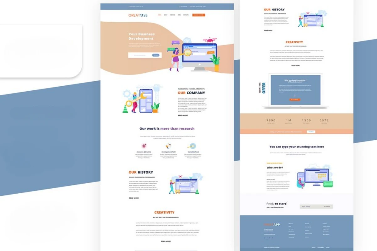
Here’s a guide on how to craft a captivating homepage:
- Hero Section:
- Kickstart your homepage with an impactful hero section. This is the first visual encounter your visitors have with your brand.
- Consider incorporating engaging elements like an animated slider, a compelling video, or a striking image. This section should succinctly communicate what your company offers and capture attention.
- Services Showcase:
- Dedicate a prominent section to showcase your services. Utilize clear headings, concise descriptions, and compelling visuals to outline what sets your offerings apart.
- If applicable, consider incorporating graphs or visual representations that highlight key aspects of your services.
- About Us:
- Introduce your company with a brief “About Us” section. Share your mission, values, and a snapshot of your journey.
- Include elements that resonate with your audience, fostering a sense of connection and trust.
- Attractive Sections:
- Segment your homepage into visually appealing sections. Each section can focus on different aspects such as testimonials, client success stories, or featured projects.
- Maintain a balance between text and visuals, ensuring a dynamic and engaging layout.
- Call to Action (CTA):
- Strategically place clear and compelling CTAs throughout your homepage. Encourage visitors to take specific actions, such as contacting you, exploring services, or subscribing to newsletters.
- Strategically place clear and compelling CTAs throughout your homepage. Encourage visitors to take specific actions, such as contacting you, exploring services, or subscribing to newsletters.
- Mobile Responsiveness:
- Verify that your homepage translates well to mobile devices. Optimize visuals and layout to ensure a seamless experience across various screen sizes.
To beautifully build these sections, you can get inspired from another website, also I do recommend importing
Remember, your homepage is a dynamic canvas to express your brand’s identity and offerings. Tailor each element to resonate with your target audience and convey a compelling narrative. As the heart of your digital presence, the homepage should leave a lasting impression and entice visitors to explore further.
8. Craft Remaining Pages:
With the captivating homepage set, extend the allure across the remaining pages of your website. Each page contributes to a comprehensive and cohesive user experience. Here’s a streamlined approach:
- Consistency is Key:
- Maintain a consistent design theme throughout all pages. This includes color palette, typography, and visual elements.
- Ensure navigation remains intuitive, allowing visitors to seamlessly explore different sections of your site.
- Detail Services and Offerings:
- Dedicate individual pages to elaborate on your various services and offerings. Use clear headings, descriptive content, and visuals to communicate the value you provide.
- Consider incorporating client testimonials or case studies to bolster credibility.
- About Us and Team:
- Further, develop your company’s narrative through an elaborated “About Us” page. Provide insight into your team, mission, and values.
- Introduce key team members with brief bios and professional photos, fostering a personal connection.
- Contact Page:
- Create an accessible and user-friendly contact page. Include a contact form, relevant contact details, and perhaps a map of physical locations.
- Encourage visitors to reach out and make the process as straightforward as possible.
- Privacy Policy and Legal Pages:
- Ensure legal compliance by including necessary pages such as the Privacy Policy, Terms of Service, and any other relevant legal documentation.
- Clearly communicate your commitment to user privacy and the terms of engagement.
By crafting each page with attention to detail and maintaining a cohesive design, you ensure that visitors consistently receive a positive and engaging experience throughout their journey on your website.
As we recommended before, don’t try to delete and redo your old blog posts, just edit them live so you won’t lose SEO, also if you wanna change the layout, you can simply customize it through the theme options easily.
9. Clear Call to Action: Convert Visitors into Customers
Congratulations on reaching this crucial stage of your website redesign! Now, it’s time to convert your visitors into customers by implementing a clear and compelling Call to Action (CTA).
This section serves as the gateway for potential clients to engage with your services or products. It is recommended that you consider dedicating a whole page to a call to action. There are a lot of strategies on how to effectively build a converting call to action page, Here is one of the most well-known strategies to Build a CTA page:
- Attractive Header and Introduction:
- Start with an attractive header or introduction that intrigues visitors and prompts them to learn more.
- In this section, Copywriting is your best ally. with good compelling headlines you will keep your prospects wanting and getting excited to learn more, so they scroll down until they find your next section.
- Showcase Your Process via Video:
- Include a video that highlights your process, showcasing how your services benefit clients.
- Incorporate testimonials or success stories from previous clients to build credibility and trust.
- Offer a 30-Minute Online Call:
- Utilize tools like Calendly or HubSpot to integrate a calendar, allowing visitors to schedule a free 30-minute online call with you.
- This strategy provides a personal touch, giving prospects a firsthand experience of your expertise and the value you offer.
- Contact Form Placement:
- Position a well-designed contact form below the video or introductory content, making it easy for visitors to reach out.
- Keep the form fields simple and relevant to encourage submissions without overwhelming the user.
- Business Details:
- Display all pertinent business details, including email addresses, phone numbers, and physical addresses.
- Provide multiple communication channels to cater to various preferences.
- Simplicity is Key:
- Keep the design and interactions simple. Avoid excessive animations or distractions that may divert visitors from the primary goal.
- Focus on guiding the prospect through a logical and straightforward process.

Remember, the ultimate aim of your CTA section is to entice visitors to take that crucial step towards engagement. By offering valuable incentives such as free consultations and presenting your services through engaging content, you create a pathway for prospects to become loyal customers.
10. Collecting Reviews + Feedback + Revisions:
Congrats on making it this far! Now that you’ve wrapped up the previous steps, it’s time for a breather and a bit of constructive input. Enter the critics—your coworkers, friends, family, and yes, even your better half.

For this feedback-gathering stage, I recommend checking out markup.io. It’s a user-friendly tool that lets you and your collaborators drop comments on any part of your website that needs attention or tweaking. Whether it’s the look and feel, content organization, or specific features, markup.io makes it easy for everyone to share their thoughts.
Once you’ve collected this insightful feedback, take a break, recharge, and then return to sift through what you’ve gathered. This step is key to spotting areas that could use improvement and ensuring your wordpress website resonates with your vision and your audience’s expectations.
Now armed with valuable input, dive into making the necessary tweaks. This iterative process helps fine-tune your website, addressing concerns that surfaced during the review. By actively engaging with the feedback, you not only improve your site’s overall quality but also bolster its effectiveness in meeting its goals.
So, embrace this collaborative phase, knowing that each piece of feedback brings you closer to creating an outstanding online presence. Happy revising!
11. Publish Website:
Alright, congrats once again! Your website is almost ready, and now it’s time to take the leap and publish it on the internet. Just hit that publish button and share your creation with the world!
12. Submit Sitemap:
Alright, this is an easy yet crucial step before you can finally take your hands off the keyboard. In fact, it’s the last action you’ll take: generate and submit your sitemap to Google. Think of it as signaling to Google, saying, ‘Hey, here’s my sitemap; go ahead and index my website.’
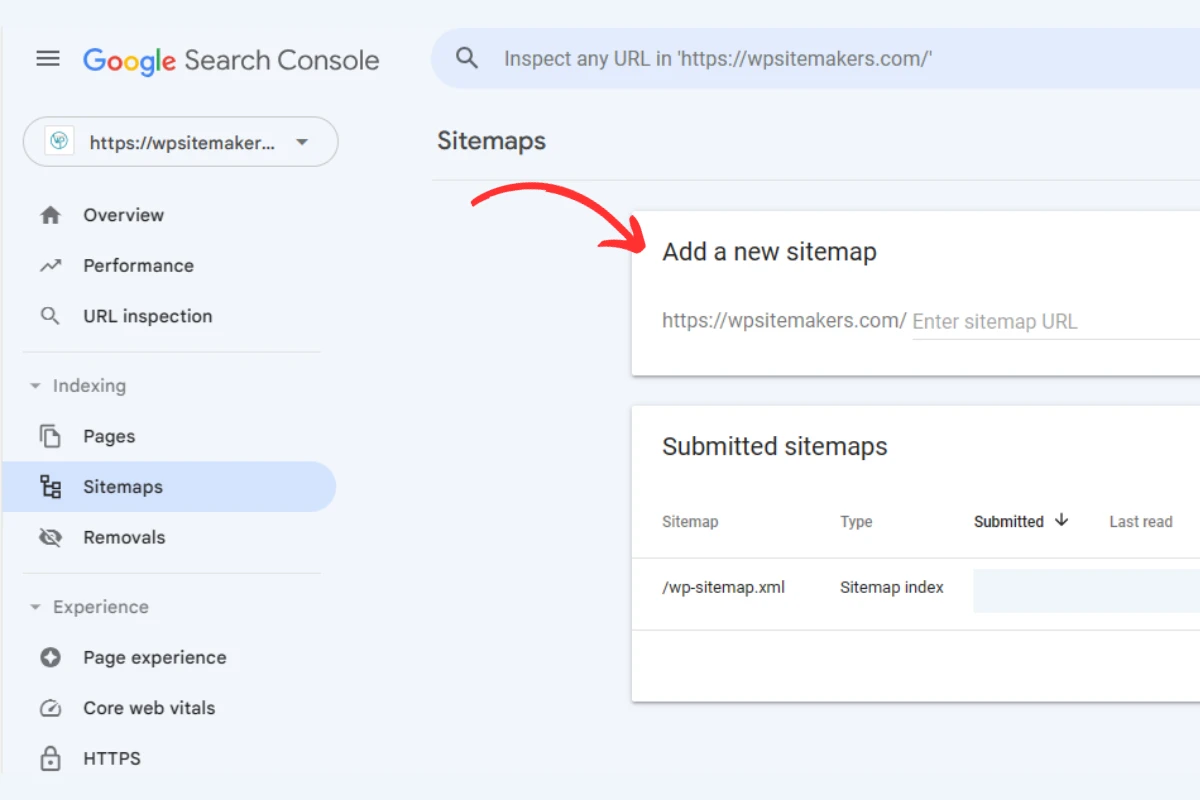
To get this done, install the Yoast SEO plugin, which makes generating a sitemap a breeze. Once you have your sitemap link, head over to Google Search Console and paste it there. Ta-da! You’ve finished submitting your sitemap. Now, be patient and give Google some time to recognize and index your website.
For other search engines like Bing, Yandex, Yahoo, and so on, you can follow a similar process with some slight variations.
Conclusion: Congrats for Redesign
Kudos on successfully revamping your WordPress website! The dedication poured into this project has resulted in a digital masterpiece. Your website now stands ready to captivate audiences and drive engagement.
This achievement isn’t just an endpoint; it’s the beginning of a dynamic online presence. Stay agile, adapt to changes, and consider the evolving needs of your users.
For those seeking quick and efficient redesign solutions, remember that WPSitemakers is here to help. Our expert team can swiftly guide you through the process, ensuring your website remains vibrant and effective in the ever-changing digital landscape.
Cheers to your redesigned website and the exciting opportunities it brings!

